
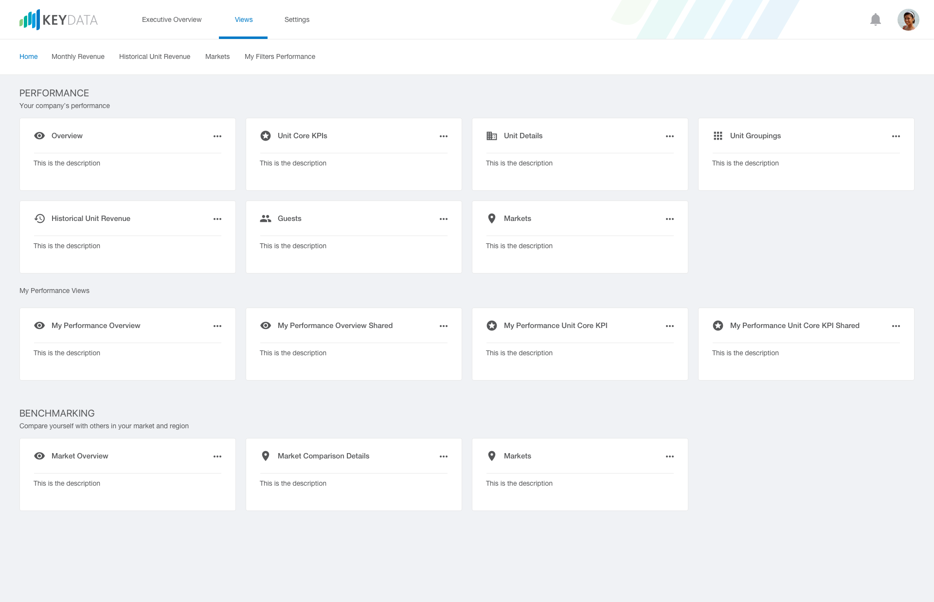
1. From the homepage, select the Performance Overview tab. For our example, we will use Spring Break 2019 season.
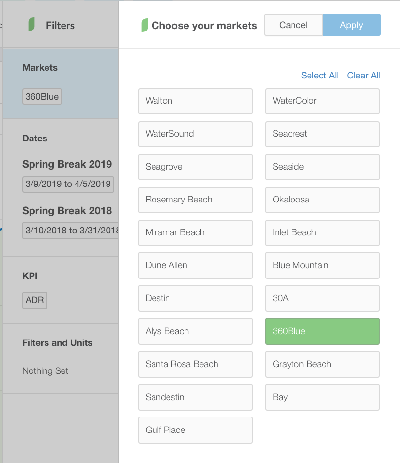
2. From the Performance Overview dashboard, click on "Markets" underneath the Filter ribbon on the far right side of the secondary navigation and select the market or markets you wish to view.
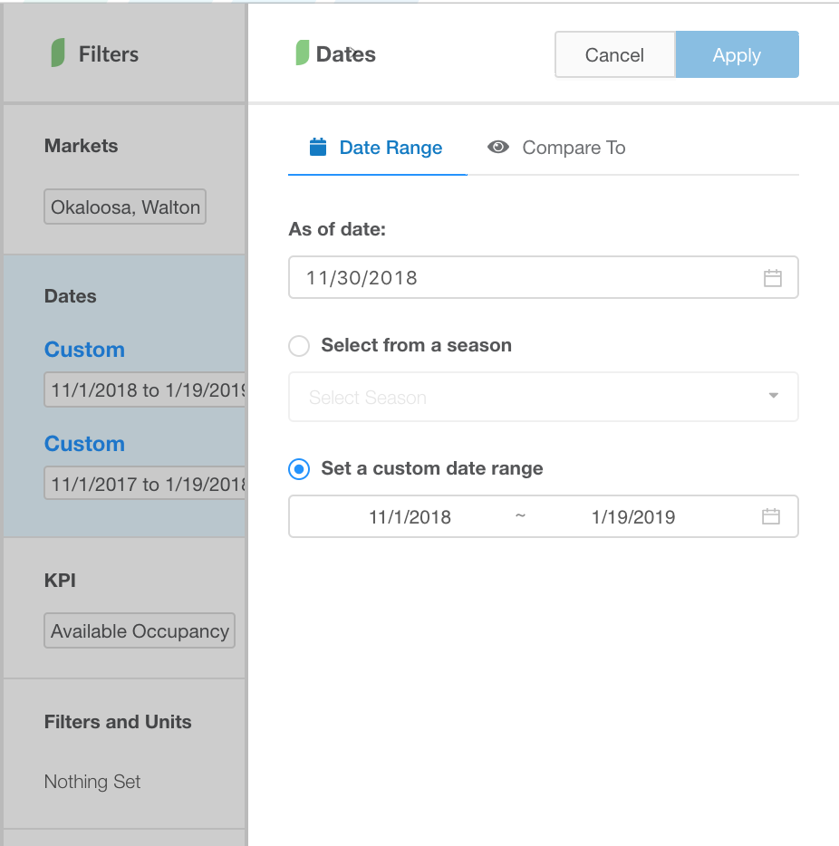
3. Once you've selected your market or markets, click on "Dates" and choose between custom seasons or a date range. For our example we will choose Spring Break 2019 under seasons. For setting your dates, you can select from a season or set a custom date range.
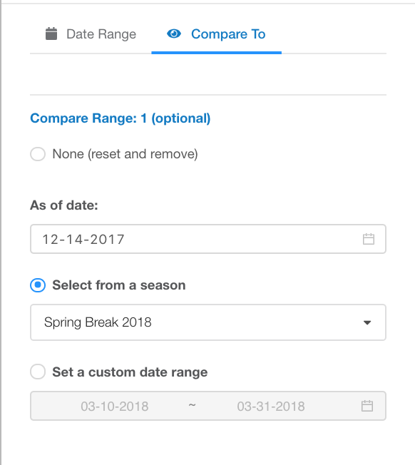
4. Next you can select the "Compare To" tab to choose your compare to date ranges. On the "Compare To" tab we will set Compare Range 1 to Spring Break 2018 under Season and set today's date last year for the As of Date. This will show us how we were doing for Spring Break 2018 as of this date last year.
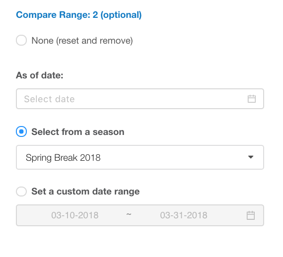
5. Finally, we will select Compare Range 2 and set the season to Spring Break 2018, however we will not choose an As of Date so we can see where we ended the season last year for a true pacing comparison.
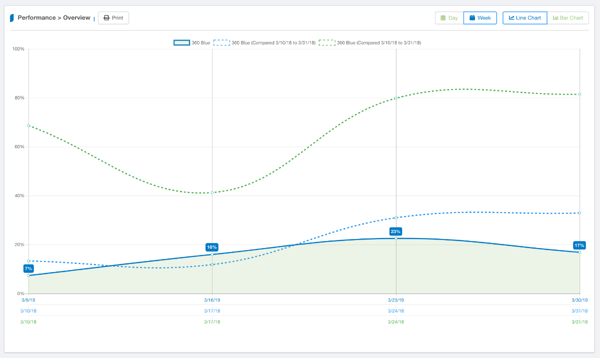
6. Once you save your date ranges, the chart will dynamically display. On the graph you will see all three date ranges are presented with different colored lines. The solid blue will be your primary date range which represents Spring Break 2019 in our example. Your compare to date ranges will show as dotted lines and will always be detailed in the chart legend. Similar to other charts within Key Data, you can also toggle between week & monthly views as well as toggle between line chart and bar chart.