Comp Sets Got a Makeover
As an organization, we determined there was an opportunity to build an industry leading Comp Set tool. Over the rest of the year, we will be rolling out reformed UI and bigger insights into our Comp Set product.
This release introduces some new terms into our company’s vocabulary. Our goal with these improvements is to help users determine the opportunity to change their rates within the context of how the Comp Set’s rates are changing & who is running the property.
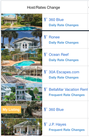
See Who Hosts Competing Units
Users can now see who operates the listing on AirBnb and VRBO.
Allowing the user the ability to see who their competitors are so they are better able to understand the current market and make decisions about their pricing.

Hide My Booked Nights Toggle Button
Filter out your booked nights to compare your open night’s rates against competitor’s rates.
Filtering out your booked nights allows you to visualize the nights where you can still control the rate.

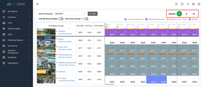
View Rate Changes for Each Day in the Comp Set Calendar View
Comp Sets now give you the ability to see if your competitor’s rates have changed in the last two weeks.
By observing a change in a specific unit’s rate, revenue managers can make more informed decisions on how to set their rates for available nights.

**Important note: Rate change only shows up if it was changed within the last 14 days.
Improved UI & General Enhancements
Months - Picker
Comp Sets now default to 3 months out, and we are giving users the ability to change how many months forward they can see.

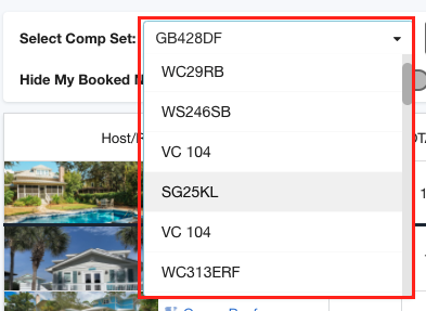
Change Comp Sets
Users can now change the Comp Set they want to view by using dropdown. Previously, a user had to go back to the summary page to choose a new unit.

New Colors
Slightly changed the colors denoting booked, booked in the last 7 days, highest and lowest rate booked.

Toggle Rate Change icons
We inform the user of a rate change with a small badge on each calendar day. This badge indicates the direction of the change (Up is green, down is orange and the percentage of change is shown). The toggle hides the text in the badge, but still lets users see if the change was up or down based on the color.
Hover modal on rate change badges
If a user hovers over a rate change badge, they will see the % of change, how much in dollars the change was and the date the change was made.
Added Month to Calendar Header

Added border between Sunday and Monday
This helps the user visualize whole weeks on a calendar.
Side Navigation defaults to closed
We wanted to drive more screen back to the view.
![keydata-logo-fullcolor-4.png]](https://support.keydatadashboard.com/hs-fs/hubfs/keydata-logo-fullcolor-4.png?height=50&name=keydata-logo-fullcolor-4.png)